 |
| <<Convert Excel Spreadsheets to Web Pages | Trading Software That Operates Within Excel | Convert Excel, Access & Other Databases | Merge Excel Files>> |
|---|
Also see our huge range ofCharting Software . Got a Excel Chart question? Use our FREEExcel Help
The below Excel chart highlights the X axis category labels when the monthly data drops below 25. This effect is achieved by using the data labels of 2 extra data series, plotted as lines.

Here is the data and formula used to build the chart. The actual data for the column chart is in the range C3:C14. The formula in columns D and E test the Data value and either output a zero or #N/A depending on whether a red or blue label should be displayed.
| B | C | D | E | |
| 2 | Data | Red Labels | Blue Labels | |
| 3 | Jan | 82 | =IF(C3<25,0,NA()) | =IF(C3>=25,0,NA()) |
| 4 | Feb | 99 | =IF(C4<25,0,NA()) | =IF(C4>=25,0,NA()) |
| 5 | Mar | 81 | =IF(C5<25,0,NA()) | =IF(C5>=25,0,NA()) |
| 6 | Apr | 20 | =IF(C6<25,0,NA()) | =IF(C6>=25,0,NA()) |
| 7 | May | 4 | =IF(C7<25,0,NA()) | =IF(C7>=25,0,NA()) |
| 8 | Jun | 35 | =IF(C8<25,0,NA()) | =IF(C8>=25,0,NA()) |
| 9 | Jul | 76 | =IF(C9<25,0,NA()) | =IF(C9>=25,0,NA()) |
| 10 | Aug | 67 | =IF(C10<25,0,NA()) | =IF(C10>=25,0,NA()) |
| 11 | Sep | 15 | =IF(C11<25,0,NA()) | =IF(C11>=25,0,NA()) |
| 12 | Oct | 18 | =IF(C12<25,0,NA()) | =IF(C12>=25,0,NA()) |
| 13 | Nov | 63 | =IF(C13<25,0,NA()) | =IF(C13>=25,0,NA()) |
| 14 | Dec | 16 | =IF(C14<25,0,NA()) | =IF(C14>=25,0,NA()) |
Select the range B2:E14 and use the chart wizard to build a standard Clustered Column chart.

Select the 'Red Label' line and right mouse click. From the popup menu choose Chart Type. Select the Line chart.
Repeat for the 'Blue Label' series.
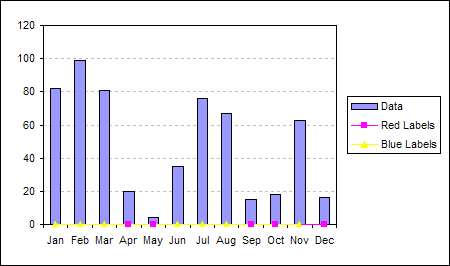
Double click the 'Red Labels' series and on the Data Labels tab of the Format Data Series dialog check the Category name option.
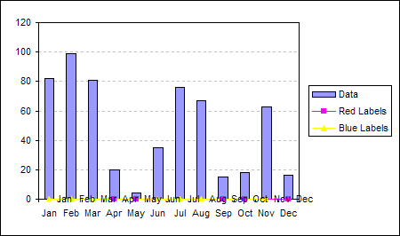
Repeat the application of data labels for the 'Blue Labels' series.

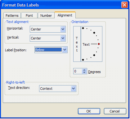
Double click the 'Red Labels' data labels and on the Alignment tab of the Format Data Labels dialog set the Label Position to Below

Repeat data label label position for the 'Blue Labels' series.
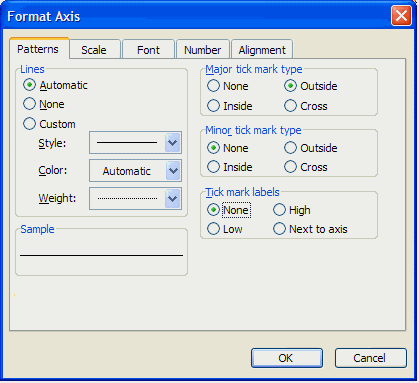
Double click the X axis and on the Patterns tab of the Format Axis dialog set the Tick Mark Labels to none.
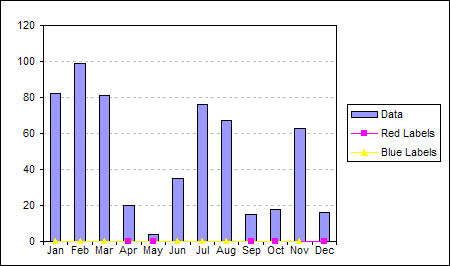
This will clear the built-in axis labels.
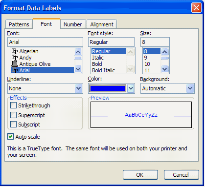
Double click the 'Red Labels' data labels and on the Font tab of the Format Data Labels dialog set the Font Color to Red

Repeat for the 'Blue Labels' data labels. Setting the Font Color to Blue.
Double click the 'Red Labels' data series and on the Patterns tab of the Format Data Series set the Line and Marker to None
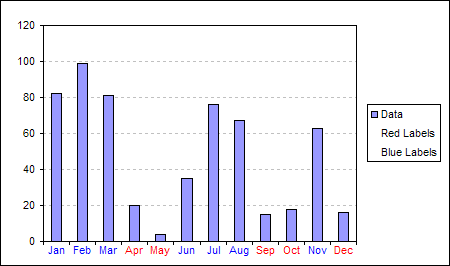
Repeat for the 'Blue Labels' series.

For a explanation of how to remove the extra series from the legend see, Delete a single entry from chart legend
Back toExcel Charts Index
Excel Dashboard Reports & Excel Dashboard Charts 50% Off Become an ExcelUser Affiliate & Earn Money
Special! Free Choice of Complete Excel Training Course OR Excel Add-ins Collection on all purchases totaling over $64.00. ALLpurchases totaling over $150.00 gets you BOTH! Purchases MUST be made via this site. Send payment proof to [email protected] 31 days after purchase date.
Instant Download and Money Back Guarantee on Most Software
Excel Trader PackageTechnical Analysis in Excel With $139.00 of FREE software!
Microsoft � and Microsoft Excel � are registered trademarks of Microsoft Corporation. OzGrid is in no way associated with Microsoft
Some of our more popular products are below...
Convert Excel Spreadsheets To Webpages | Trading In Excel | Construction Estimators | Finance Templates & Add-ins Bundle | Code-VBA | Smart-VBA | Print-VBA | Excel Data Manipulation & Analysis | Convert MS Office Applications To...... | Analyzer Excel | Downloader Excel | MSSQL Migration Toolkit | Monte Carlo Add-in | Excel Costing Templates
FREE Excel Help